via informationisbeautiful.net Although this pyramid is simple, the concepts presented as raw data progresses to information to knowledge and ...
2009 In One Word
via npr.org What one word did over 5000 Facebook and Twitter users use to sum up 2009? This Tag Cloud From Wordle lays out the largest clusters of ...
A Global View Of The Housing Bubble
via mckinseyquarterly.com This interesting graph from McKinsey highlights the tremendous run up in home prices on inflation adjusted terms over the ...
McSaturation of The Continental United States
via weathersealed.com This map uses geolocatiion data to plot the density of the 13,000 US McDonald's franchise locations and color to represent the ...
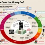
How The Average US Consumer Spends Their Paycheck
There's a great infographic posted recently on the Visual Economics Blog. The infographic design itself is good, because it's clean, colorful ...
