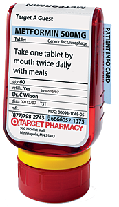
I first came upon the Target ClearRx concept from a post from Matt May’s excellent In Pursuit Of Elegance blog. A sucker for innovative, user based clean design I did a little research on this story. Though it dates back to 2005, it’s a great story of how Necessity Really Is the Mother Of Innovation. Designed by Deborah Adler while still a student at the School Of Visual Arts, this step change reset to the traditional pharmacy pill bottle emerged out of an incident where her Grandmother took her Grandfather’s medicine by mistake sending her to the hospital. Thinking through the problems with the traditional incumbent design, she identified several opportunities:
- Labelling was inconsistent from pharmacy to pharmacy
- Typically the biggest font on the label was the brand of the pharmacy
- Numbers frequently added to confusion rather than clarified it (3: 3 pills or 3 times per day?)
- No flat surface means that the bottle has to be rotated to read the entire label

After rapid prototyping (Remember: Fail Fast Forward), she settled on a solution set which offers a number of clear improvements to the historical pill bottle concept:
- The Name and Dose of the drug are the most prominent text, largest font, first row of the bottle
- She utilized a clear and consistent information hierarchy by separating the label into two halves separated by a line. Name , Dose and Instructions are above the line. Required but less important info (qty, expiration date, Doctor, Pharmacy phone number) are below the line in smaller type.
- Color coded rubber rings attached to the neck of the bottle ensure that, just like with a communal electric toothbrush, you never put something in your mouth which was intended for somebody else in your family.
- A detailed card with more specific information (side effects, interactions etc) is tucked into a slot behind the label, as opposed to being stapled on the outside of the bag (and quickly thrown away.)
Deborah shopped her design, but it was quickly snagged up by Target, who bought the IP and rolled the concept out across their chain. The concept is consistent with Target’s overall brand image and has been an unqualified success. You can learn more about the design and innovation process for ClearRX at Peter Merholz’s Experience Matters blog and in the article “The Perfect Prescription” from New York Magazine.
Personally, I find it to be a great example of how a dominant industry format can be re-engineered from the bottom up by thinking thoughtfully about the way users interact with the product and trying to streamline and improve the user experience via human factors study. Just because a design format is time tested and well entrenched, it doesn’t mean it is immune to innovation.
Leave a Reply